Reposted by Erik Larsen
every day millions of people log on to fulfill their one overriding desire: being the biggest possible asshole to complete strangers, online
3 replies
9 reposts
104 likes
There was a lot of just trying out shit and seeing if it flew. If not--they moved on and never talked about it ever again.
1 replies
0 reposts
8 likes
These one-off explanations were especially weird. Like--Superman hides his clothes in a hollow tooth? When did he get a hollow tooth? Then there was some idiotic explanation of why everybody thinks Clark looks different--Hypnotism? Early on Superman could mould his face to change his appearance.
4 replies
0 reposts
11 likes
They never really addressed what he does with his shoes.
4 replies
0 reposts
8 likes
And it wasn't a case of us saying "it's comics and therefor they didn't have to be good"--it was more "it's comics so we can do anything we want to do! We're not confined by reality! We don't have to obey the rules!"
6 replies
3 reposts
47 likes
And that was it, really.
Venom could look cool or he could look shitty and we all decided that cool was the way to go.
0 replies
0 reposts
7 likes
Superman used to keep Clark Kents clothes in a pocket in his cape but nobody ever drew it to look like they were in there. His glasses disguise worked because it worked.
The Flash's costume was stored in a ring but we never saw him putting it back in there. We just saw it coming out.
2 replies
0 reposts
44 likes
There are a lot of things in comics where we all just kind of looked the other way.
Bruce Banner's pants fit the Hulk because they don't want to show you his pecker--it's as simple as that.
The webs on Spider-Man's costume in the comics change direction depending on which way they're facing.
2 replies
3 reposts
74 likes
Ready for the answer? You're not going to like it.
It's because it looked cool and nobody gave a shit that it didn't make sense.
We all collectively decided that it doesn't fucking matter if Venom's mouth jibed with Eddie Brock's mouth.
We fudged it and kept on fudging it because it looked cool.
5 replies
4 reposts
85 likes
Clearly Marvel DID plan to continue doing the longer books as several stories in various books ended up getting chopped in two and one-off back up stories were added in some cases to fill pages. I expect they realized longer stories were unsustainable with their staff and backed off.
1 replies
0 reposts
1 likes
The acetate cover didn’t make Marvels a hit. The book made the book a hit.
Dark Knight Returns would have been just as big if it was saddle stitched instead of square bound. It wasn’t the format that made it succeed.
0 replies
1 reposts
8 likes
It’s human nature to ascribe cause and effect to superficial attributes. A gorgeous starlet gets a nose ring and dress made of lint and other girls follow her lead as if that’s the magic formula instead of being a pretty girl.
Marvels was going to be a hit with or without an acetate cover.
2 replies
2 reposts
10 likes
Then there's "fans love grim and gritty comics" or "fans love realism" or "fans hate thought balloons and sound effects."
It's just infuriating. Publishers see the superficial details and jump to crazy conclusions.
1 replies
1 reposts
16 likes
I remember well that period where publishers and creators learned all the wrong lessons from Dark Knight, Watchmen and Marvels.
"Fans love square bound comics."
"Fans love 9-panel grids."
"Fans love acetate covers."
"Fans love painted comics."
Guys--no. That's not it.
1 replies
1 reposts
15 likes
If that’s your takeaway from Understanding Comics you really need to lay off the scotch.
0 replies
0 reposts
2 likes
When all the worst people hate something I do feel compelled to check it out.
1 replies
1 reposts
19 likes
Pretty sure it’s the Joker.
0 replies
0 reposts
1 likes
I have a love/hate relationship with Neal’s work. Sometimes it’s super effective and sometimes it is really trying too hard to be clever or characters flail about looking somewhat broken. This, to me, is more strange looking than clever.
3 replies
1 reposts
15 likes
It’s how he was actually colored.
1 replies
0 reposts
1 likes
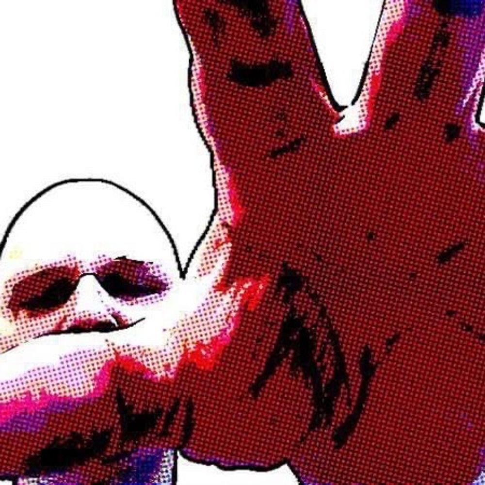
The top image here is from the BLACK cover (and the interiors of the PURPLE cover look much the same)--the bottom from the RED cover. I don't know how the rest of the run looks--the ones in my local store look fine--but I am curious to know how YOUR copies look.
0 replies
0 reposts
4 likes
Okay--I have Savage Dragon 271 comps and at the risk of the most banal spoiler possible--the printing in my copies with the red cover have numerous pages where the Cyan plate was way too oversaturated. Here's an example (and there are plenty of others but I don't want to post anything TOO spoilery).
2 replies
1 reposts
6 likes
Reposted by Erik Larsen
"These are awful people who like imposing cruelty on out groups and blaming them for all their problems. You can process that into a political 'position,' but really these are just shitty people, even if you can't say that out loud." -- @volts.wtf
10 replies
74 reposts
312 likes
The one thing Adams didn't take into account was that various papers configured the strip in different ways. In some paper the strip would have looked like THIS and the hidden head was completely lost.
1 replies
1 reposts
6 likes